If you're not sending responsive emails you might be making it very difficult for your recipients to read your content. If they can't read the email what chance have you got of them replying to you or taking any action?
With so many different device sizes, operating systems and email clients/apps it's crucial that you use responsive email design so that whatever device or client your recipient is using they'll be able to read your email.
What is responsive email design
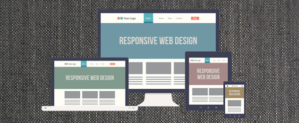
Responsive web pages have been around for some time now. A responsive web page enables web developers to cater their design to the size of the browser that the user is using. This is how developers can make a website look great on mobile, tablet and desktops all at the same time.

Responsive email design is the same concept but for emails that you send. Responsive email design is more problematic though as there are many more email clients than there are browsers. The web is now dominated by 3 rendering engines but in email you have different rendering engines across Outlook, Windows Mail, Thunderbird, Apple Mail as well as web-based clients like Gmail.
Regardless, the key to great responsive design is ensuring that the same content can be re-arranged in a way that makes sense regardless of the size of the device. Often, this means that on mobile your content is stacked up all in to a single column but as the width of the device increases you can start putting content in to multiple columns.
So how do you make responsive emails?
Making responsive emails that look great is a bit of a dark art! With so many email clients being based on old html rendering engines you really don't want to write a modern html5 based web page and just use that. It will work on web-based clients like Gmail or Outlook.com but that's about it.
To get maximum compatibility with your emails you should remember the following tips:
- CSS for layout generally just doesn't work. Your best bet is to go old-school and use tables for your layout.
- External CSS should be avoided (as some email clients won't go fetch external files due to spam issues) so you should keep the CSS in the email
- You should really "inline" your CSS as some clients will remove CSS from the <head> section of the email. There are tools to help you do this such as https://htmlemail.io/inline/
- Ensure that images have src,alt,width,height,border properties all set as well as CSS styles as some email clients will ignore your css styles.
A simple email template
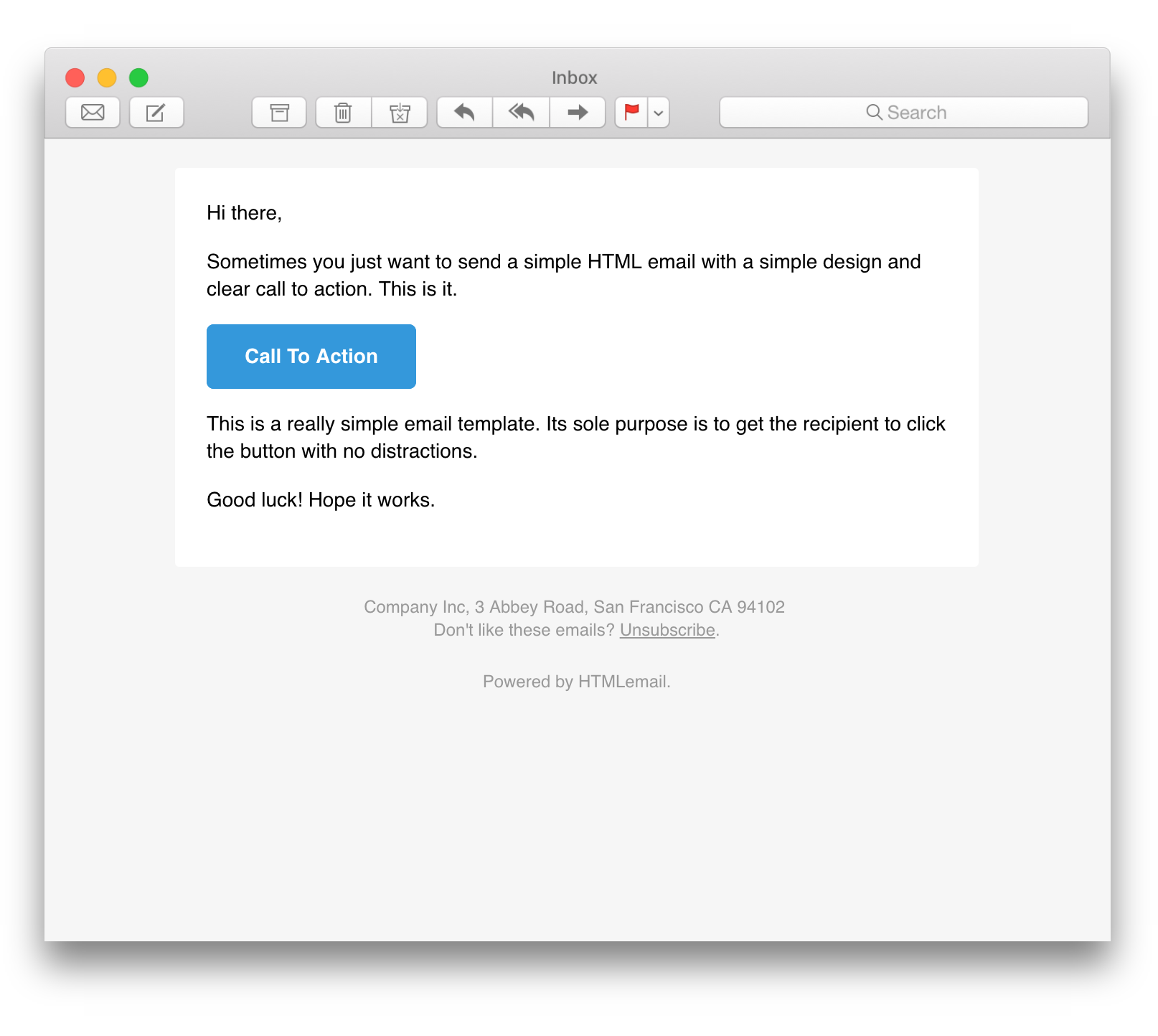
If you're just creating simple transactional type emails (simple emails with maybe a header but basically plain text) then you can get away with using a simple email template and just changing the text yourself. For example, this responsive html template provides a simple plain text like feel that's responsive across different device sizes:
https://github.com/leemunroe/responsive-html-email-template

A better template
Ok, let's say you've not designed your emails yet but you know that you'd like something "nicer" than the simple template above. The quickest way of getting something going is go search for "responsive email templates", pick one that you like and then customise it to suit your use case.
A custom design
Either you've had a designer provide the email design for you or you're looking to really set your brand apart with a bespoke email template. The best thing here is to make use of one of the many tools available online that will help you generate responsive email templates. At Imitate Email, we use MJML for our email templates coupled with Liquid template language for dynamic content.
MJML
MJML pitches itself as the only framework that makes responsive email easy and we agree with that. MJML is a mark up language, that looks a lot like html, which provides elements for you to construct your emails with. These elements are then compiled in to their equivalent html elements such that all of the quirks of email development is handled by that and you can just focus on your design in MJML.
For example, the following MJML template:
<mjml>
  <mj-body>
    <mj-section>
      <mj-column>

        <mj-image width="100px" src="/assets/img/logo-small.png"></mj-image>

        <mj-divider border-color="#F45E43"></mj-divider>

        <mj-text font-size="20px" color="#F45E43" font-family="helvetica">Hello World</mj-text>

      </mj-column>
    </mj-section>
  </mj-body>
</mjml>
is compiled in to an html document which contains your standard HTML elements (designed using <table>s), all the CSS (that's inlined for you) as well as various hacks to ensure compatibility across different clients.
<!doctype html>
<html xmlns="http://www.w3.org/1999/xhtml" xmlns:v="urn:schemas-microsoft-com:vml" xmlns:o="urn:schemas-microsoft-com:office:office">
<head>
<title>
</title>
<!--[if !mso]><!-->
<meta http-equiv="X-UA-Compatible" content="IE=edge">
<!--<![endif]-->
<meta http-equiv="Content-Type" content="text/html; charset=UTF-8">
<meta name="viewport" content="width=device-width, initial-scale=1">
<style type="text/css">
#outlook a {
padding: 0;
}
body {
margin: 0;
padding: 0;
-webkit-text-size-adjust: 100%;
-ms-text-size-adjust: 100%;
}
table,
td {
border-collapse: collapse;
mso-table-lspace: 0pt;
mso-table-rspace: 0pt;
}
img {
border: 0;
height: auto;
line-height: 100%;
outline: none;
text-decoration: none;
-ms-interpolation-mode: bicubic;
}
p {
display: block;
margin: 13px 0;
}
</style>
<!--[if mso]>
<noscript>
<xml>
<o:OfficeDocumentSettings>
<o:AllowPNG/>
<o:PixelsPerInch>96</o:PixelsPerInch>
</o:OfficeDocumentSettings>
</xml>
</noscript>
<![endif]-->
<!--[if lte mso 11]>
<style type="text/css">
.mj-outlook-group-fix { width:100% !important; }
</style>
<![endif]-->
<style type="text/css">
@media only screen and (min-width:480px) {
.mj-column-per-100 {
width: 100% !important;
max-width: 100%;
}
}
</style>
<style media="screen and (min-width:480px)">
.moz-text-html .mj-column-per-100 {
width: 100% !important;
max-width: 100%;
}
</style>
<style type="text/css">
@media only screen and (max-width:480px) {
table.mj-full-width-mobile {
width: 100% !important;
}
td.mj-full-width-mobile {
width: auto !important;
}
}
</style>
</head>
<body style="word-spacing:normal;">
<div style="">
<!--[if mso | IE]><table align="center" border="0" cellpadding="0" cellspacing="0" class="" style="width:600px;" width="600" ><tr><td style="line-height:0px;font-size:0px;mso-line-height-rule:exactly;"><![endif]-->
<div style="margin:0px auto;max-width:600px;">
<table align="center" border="0" cellpadding="0" cellspacing="0" role="presentation" style="width:100%;">
<tbody>
<tr>
<td style="direction:ltr;font-size:0px;padding:20px 0;text-align:center;">
<!--[if mso | IE]><table role="presentation" border="0" cellpadding="0" cellspacing="0"><tr><td class="" style="vertical-align:top;width:600px;" ><![endif]-->
<div class="mj-column-per-100 mj-outlook-group-fix" style="font-size:0px;text-align:left;direction:ltr;display:inline-block;vertical-align:top;width:100%;">
<table border="0" cellpadding="0" cellspacing="0" role="presentation" style="vertical-align:top;" width="100%">
<tbody>
<tr>
<td align="center" style="font-size:0px;padding:10px 25px;word-break:break-word;">
<table border="0" cellpadding="0" cellspacing="0" role="presentation" style="border-collapse:collapse;border-spacing:0px;">
<tbody>
<tr>
<td style="width:100px;">
<img height="auto" src="/assets/img/logo-small.png" style="border:0;display:block;outline:none;text-decoration:none;height:auto;width:100%;font-size:13px;" width="100" />
</td>
</tr>
</tbody>
</table>
</td>
</tr>
<tr>
<td align="center" style="font-size:0px;padding:10px 25px;word-break:break-word;">
<p style="border-top:solid 4px #F45E43;font-size:1px;margin:0px auto;width:100%;">
</p>
<!--[if mso | IE]><table align="center" border="0" cellpadding="0" cellspacing="0" style="border-top:solid 4px #F45E43;font-size:1px;margin:0px auto;width:550px;" role="presentation" width="550px" ><tr><td style="height:0;line-height:0;">
</td></tr></table><![endif]-->
</td>
</tr>
<tr>
<td align="left" style="font-size:0px;padding:10px 25px;word-break:break-word;">
<div style="font-family:helvetica;font-size:20px;line-height:1;text-align:left;color:#F45E43;">Hello World</div>
</td>
</tr>
</tbody>
</table>
</div>
<!--[if mso | IE]></td></tr></table><![endif]-->
</td>
</tr>
</tbody>
</table>
</div>
<!--[if mso | IE]></td></tr></table><![endif]-->
</div>
</body>
</html>
It's fairly obvious, just from looking at these two code snippets, that MJML offers significant benefits over hand-crafting the HTML yourself.
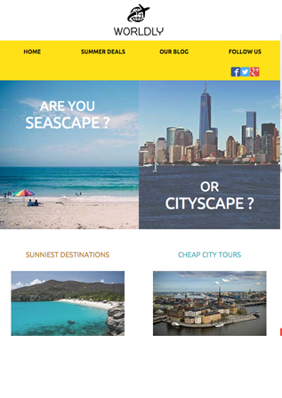
Not only is MJML great itself, they also provide an online code editor which compiles MJML on the fly and provides a preview for you next to your code. You can also start with a completely empty template or start with one of their templates (example below). Go try it out here:

Liquid template language
Creating your responsive design is one thing. Filling it with dynamic content is another. Sometimes it's easy, swap out a name here, a URL there. Other times, you've got quite dynamic content like the products table on a dynamically generated email receipt.
This is where you want to combine the power of MJML with a templating language. In the past we've used simple templating languages like Handlebars but, as it's tagline confirms, it's "minimal templating on steroids". We've found it to be lacking a little in the past, especially being based on Javascript, so now prefer the Liquid template language from shopify. In our instance we make use of the Fluid Parser for a .Net implementation.
You have a couple of approaches to generating your dynamic emails at runtime. Either compile the MJML templates at build time or compile the MJML templates at runtime. The difference will depend on how dynamic the content is. Either way, the best way to embed liquid template language inside your MJML template is by using <mj-raw></mj-raw> around your liquid syntax. That ensures that it's ignored by the MJML compiler.
Summary
This article gives you an idea of what responsive email design is, why it's important and how to achieve it in the best/most efficient way (or at least how we do it at Imitiate Email). Once you're happy with your email design you may want to test it out. Check out our demo of Imitate Email on the home page to see we can help.
